目次
ボタンの基本設定
まずは、「Arkheボタン」のブロックを追加していきます。
固定ページなどで、画面左上の青色「+」マークをクリックして、「ボタン」を追加します。
WordPressで基本実装されている「ボタン」と「Arkheボタン」の2種類があるので、間違えないように気をつけてください。
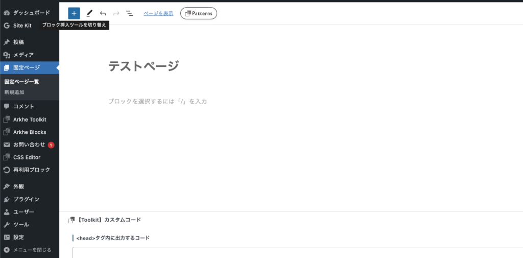
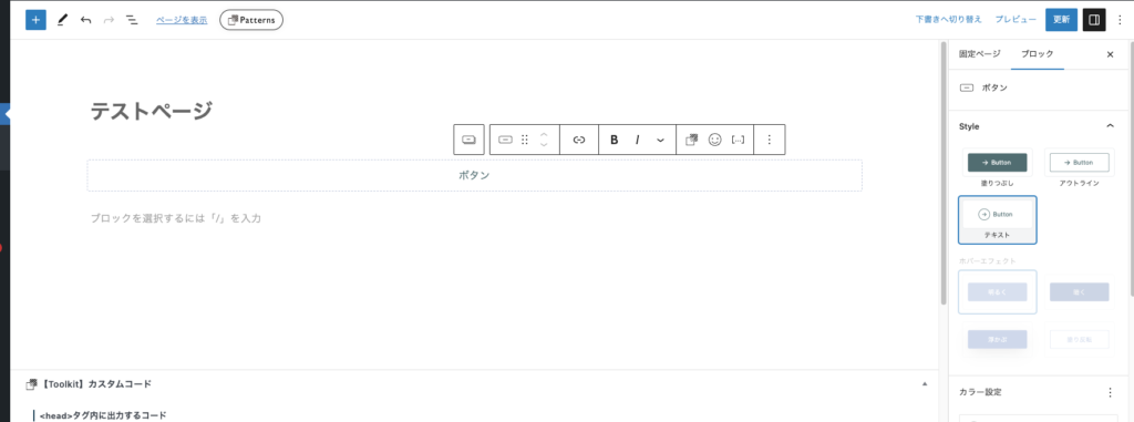
ボタンを追加したら、画面右側の「Style」で「テキスト」スタイルを選択します。
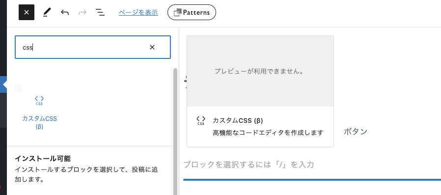
次に、「カスタムCSS」ブロックを追加します。
画面左上の青色「+」マークをクリックして、「カスタムCSS」を追加します。
「カスタムCSS」を使うことで、該当ページ内のみでCSSを反映させることができるようになります。
黒色背景のブロックが追加されたら準備完了です。
「ボタン」のデザイン一覧
あとは、以下の一覧の中から、実際に使ってみたいデザインを選んで、「カスタムCSS」内にペーストすると、レイアウトが反映されるようになります!
気に入っていただけた場合には、ぜひ使ってみてください。
※ 随時追加予定です。
カーソルを合わせると枠線が絵画される
/* デフォルトボタン カスタマイズ */
.is-btn-text .ark-block-button__link:hover {
	text-decoration: none;
}
.is-btn-text .ark-block-button__icon {
	border: none;
}
.is-btn-text .ark-block-button__link:hover .ark-block-button__icon {
	background: transparent;
}
/* ボタンアニメーション */
.ark-block-button.is-btn-text {
	position: relative;
	min-width: 200px;
	margin: 0 auto;
	padding: .9em 2em;
}
.ark-block-button.is-btn-text::before,
.ark-block-button.is-btn-text::after {
	position: absolute;
	z-index: -1;
	width: 0;
	height: .5px;
	content: '';
}

.ark-block-button.is-btn-text::before {
	top: -1px;
	left: 0;
	border-top: .5px solid transparent;
	border-right: .5px solid transparent;
}

.ark-block-button.is-btn-text::after {
	bottom: 0;
	right: 0;
	border-bottom: .5px solid transparent;
	border-left: .5px solid transparent;
}

.ark-block-button.is-btn-text:hover::before,
.ark-block-button.is-btn-text:hover::after {
	width: 100%;
	height: 100%;
	border-color: var(--ark-color--text);
	transition: width .3s ease, height .3s .3s ease;
}
.is-btn-text .ark-block-button__link {
	z-index: 1;
}
下線が伸びるアニメーション
/* デフォルトボタン カスタマイズ */
.is-btn-text .ark-block-button__link:hover {
    text-decoration: none;
}
.is-btn-text .ark-block-button__icon {
	border: none;
}
.is-btn-text .ark-block-button__link:hover .ark-block-button__icon {
	background: transparent;
}

/* ボタンアニメーション */
.ark-block-button.is-btn-text {
    display: flex;
    justify-content: center;
    position: relative;
    min-width: 200px;
    margin: 0 auto;
    padding: .9em 2em;
    border: none;
    border-bottom: .5px solid var(--ark-color--text);
    background-color: transparent;
}
.ark-block-button.is-btn-text::after {
    position: absolute;
    bottom: -1px;
    left: 0;
    transform: scaleX(0);
    transform-origin: center left;
    width: 100%;
    height: 1.5px;
    background-color: var(--ark-color--main);
    content: '';
    transition: transform .3s ease;
}

.ark-block-button.is-btn-text:hover::after {
    transform: scaleX(1);
}
.is-btn-text .ark-block-button__link {
	z-index: 1;
}
枠線が伸びる(角が飛び出る)
/* デフォルトボタン カスタマイズ */
.is-btn-text .ark-block-button__link:hover {
	text-decoration: none;
}
.is-btn-text .ark-block-button__icon {
	border: none;
}
.is-btn-text .ark-block-button__link:hover .ark-block-button__icon {
	background: transparent;
}

/* ボタンアニメーション */
.ark-block-button.is-btn-text {
	position: relative;
	color: var(--ark-color--text);
	padding: 10px 30px;
 	display: inline-block;
	text-decoration: none;
	outline: none;
}
.ark-block-button.is-btn-text::before,
.ark-block-button.is-btn-text::after {
  content:'';
  position: absolute;
  border: .5px solid var(--ark-color--text);
  width: 20px;
  height: 20px;
  transition: all 0.3s ease-in-out;
}

.ark-block-button.is-btn-text::before{
  top:0;
  left:0;
  border-width: .5px 0 0 .5px;
}

.ark-block-button.is-btn-text::after{
  bottom: 0;
  right: 0;
  border-width: 0 .5px .5px 0;
}

.ark-block-button.is-btn-text:hover::before,
.ark-block-button.is-btn-text:hover::after{
  width: calc(100% + 15px);
  height: calc(100% + 15px);
  border-color: var(--ark-color--text);
}

.is-btn-text .ark-block-button__link {
	padding: 1rem 2.5rem;
	z-index: 1;
}
枠線が伸びる(角が飛び出ない)
/* デフォルトボタン カスタマイズ */
.is-btn-text .ark-block-button__link:hover {
	text-decoration: none;
}
.is-btn-text .ark-block-button__icon {
	border: none;
}
.is-btn-text .ark-block-button__link:hover .ark-block-button__icon {
	background: transparent;
}

/* ボタンアニメーション */
.ark-block-button.is-btn-text {
	position: relative;
	color: var(--ark-color--text);
	padding: 10px 30px;
 	display: inline-block;
	text-decoration: none;
	outline: none;
}
.ark-block-button.is-btn-text::before,
.ark-block-button.is-btn-text::after {
  content:'';
  position: absolute;
  border: .5px solid var(--ark-color--text);
  width: 20px;
  height: 20px;
  transition: all 0.3s ease-in-out;
}

.ark-block-button.is-btn-text::before{
  top:0;
  left:0;
  border-width: .5px 0 0 .5px;
}

.ark-block-button.is-btn-text::after{
  bottom: 0;
  right: 0;
  border-width: 0 .5px .5px 0;
}

.ark-block-button.is-btn-text:hover::before,
.ark-block-button.is-btn-text:hover::after{
  width: calc(100% + 0px);
  height: calc(100% + 0px);
  border-color: var(--ark-color--text);
}

.is-btn-text .ark-block-button__link {
	padding: 1rem 2.5rem;
	z-index: 1;
}
カーテンがスライド
/* デフォルトボタン カスタマイズ */
.is-btn-text .ark-block-button__link:hover {
		text-decoration: none;
}
.is-btn-text .ark-block-button__icon {
	border: none;
}
.is-btn-text .ark-block-button__link:hover .ark-block-button__icon {
	background: transparent;
	color: var(--ark-color--text);
}
/* ボタンアニメーション */
.ark-block-button.is-btn-text {
    position: relative;
    transition: 0.3s linear;
    background: var(--ark-color--main);
    overflow: hidden;
	border: .5px solid var(--ark-color--text);
}
.ark-block-button.is-btn-text:before {
    position: absolute;
    top: 0;
    left: 0;
    width: 150%;
    height: 500%;
    content: "";
    -webkit-transition: all 0.3s linear;
    transition: all 0.3s linear;
    -webkit-transform: translateX(-110%) translateY(-60%) rotate(45deg);
    transform: translateX(-110%) translateY(-60%) rotate(45deg);
    background: var(--ark-color--text);
    opacity: 0.3;
}
.ark-block-button.is-btn-text:hover {
	color: var(--ark-color--text);
}
.ark-block-button.is-btn-text:hover:before {
    -webkit-transform: translateX(-9%) translateY(-45%) rotate(45deg);
    transform: translateX(-9%) translateY(-45%) rotate(45deg);
}

.is-btn-text .ark-block-button__link {
	padding: 1rem 2.5rem;
	z-index: 1;
}